Gin & Tonic

Choose Frame ↴
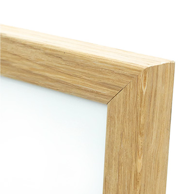
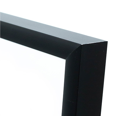
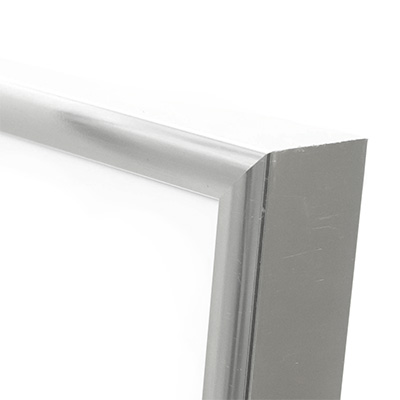
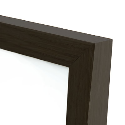
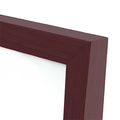
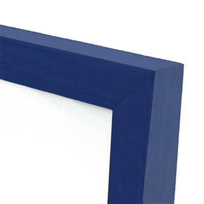
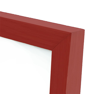
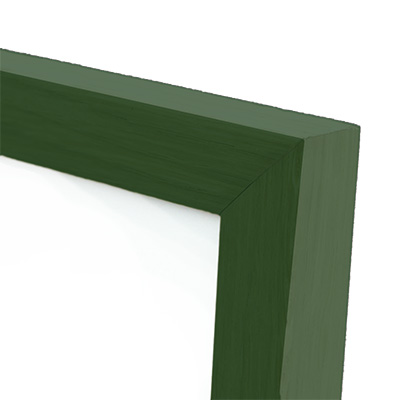
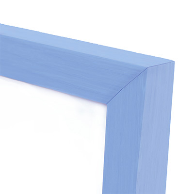
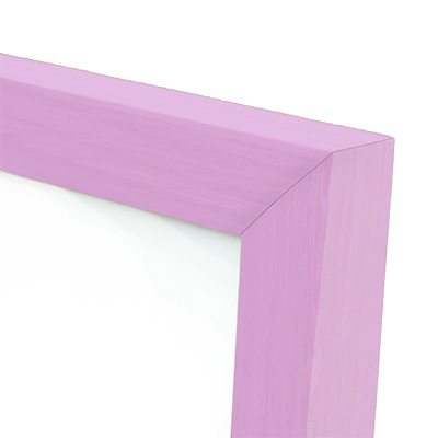
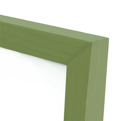
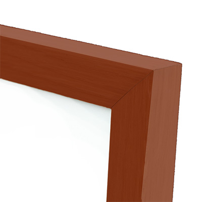
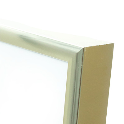
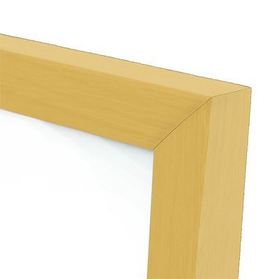
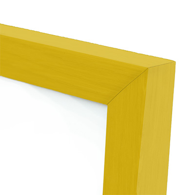
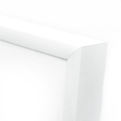
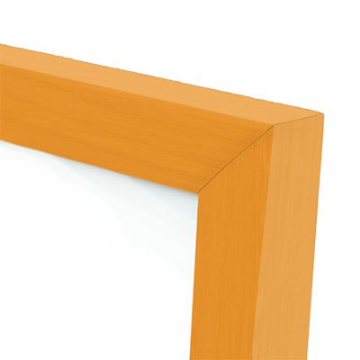
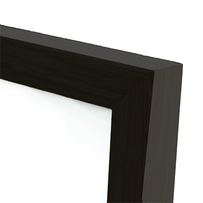
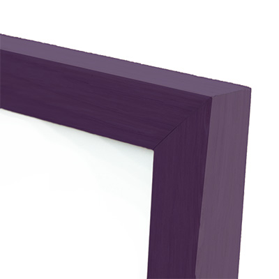



Price range: 55 kr. through 429 kr.
Paper type: Hahnemühle Matte Art Paper
Papir thickness: 210 g/m2
The artwork was reviewed and printed in the Kræss Print Studio in collaboration with the artist. We ensure that print quality, colors, and paper are of the highest quality and that the artist is paid for every copy sold. This way, we secure creativity and quality for both the artist and the customer.
Stock status
Webshop: The poster is in stock. Shipping takes 1-3 business days (depending on your location).
Store: The poster is in stock in our store in Copenhagen. Come by or choose Click & Collect.
Return and gift policy
30-day return policy: You can return the item online for a refund. If you chose to have the poster framed, you can also return the frame.
If it is a gift: In the cart, you can optionally add an exchange label and gift wrapping. If you chose to have the poster framed, the recipient can also exchange the frame.
Extended exchange period for Christmas: All gifts can be exchanged up to and including 1 February 2027.
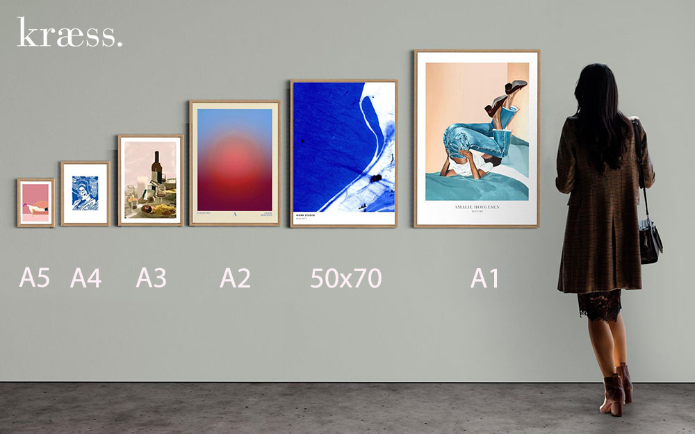
All our frames are of good quality and made of real glass.
We have chosen our frames to be affordable because we want you to be able to hang your poster in your home as soon as you receive it.
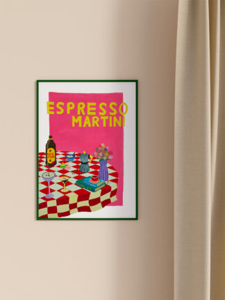
My take on a gin and tonic poster. Quite different from my “normal” motifs. I usually use many different colors. Fun color combinations and contrasting colors, which should preferably not go too much into each other. Here I chose to use blue as my starting point. It was probably mostly because blue was the paint that was closest to me – and that I just wanted to get started quickly. My friend asked me if I could paint some drink motifs for her. I said yes, but that it was not within my field of expertise. I didn't know how to express something that I was unfamiliar with and that would at the same time characterize me and my brushstrokes. I started sketching something up, and it occurred to me that when I paint, I love capturing moods. I like to take an experience or situation and express it through colors and slightly imperfect lines. In this case, my starting point was drinks, and how I could create a mood around it. Therefore, there is no particular focus on the drink itself, but rather everything and everything around it combined into one unit.


Falang Noi
Falang Noi – something I have often been called throughout my childhood. Briefly translated from Thai, it means “The little stranger”. And is something I have often felt like, both in Denmark, where I was born, and in Thailand, where my mother comes from.
When I was younger, I had difficulty making sense of two very different cultures, and saw it more as a disadvantage than an advantage.
However, as I have grown older and gained a deeper understanding of where I come from – and especially my roots in Thailand, my view has changed. Now most of my inspiration comes from a combination of exactly this, the best of both worlds.
I try to show this double meaning of “something strange” through my works. Here I mix the colors and many impressions of Thailand with the minimalism and city life of Denmark. These contrasts lead to works that are not perfect, but tell good stories
Love Falang Noi? Get notified by email when Falang Noi releases new works.
Related products
-
POPULAR
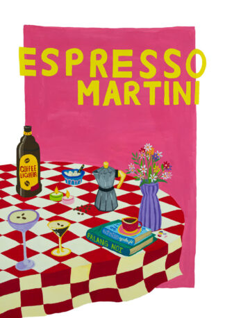

Espresso Martini
Price range: 55 kr. through 429 kr. -

Midnatsol
Price range: 55 kr. through 549 kr. -
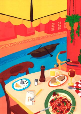
Frokost ved Navigli
Price range: 55 kr. through 549 kr. -
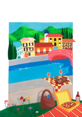
Kaisa
Price range: 55 kr. through 549 kr.